As you brainstorm color schemes and wedding décor, keep in mind that there are certain tricks to coordinating a beautiful and cohesive palette that fits your unique aesthetic, pleases every eye and stands the test of time (you will be looking at your wedding photos for years to come). Here are 13 common color misconceptions and style mistakes to avoid when selecting your wedding hues.
1. Mistake: Using Too Many Colors
photo by ABBY JIU PHOTOGRAPHY
The Fix: Keep It Simple
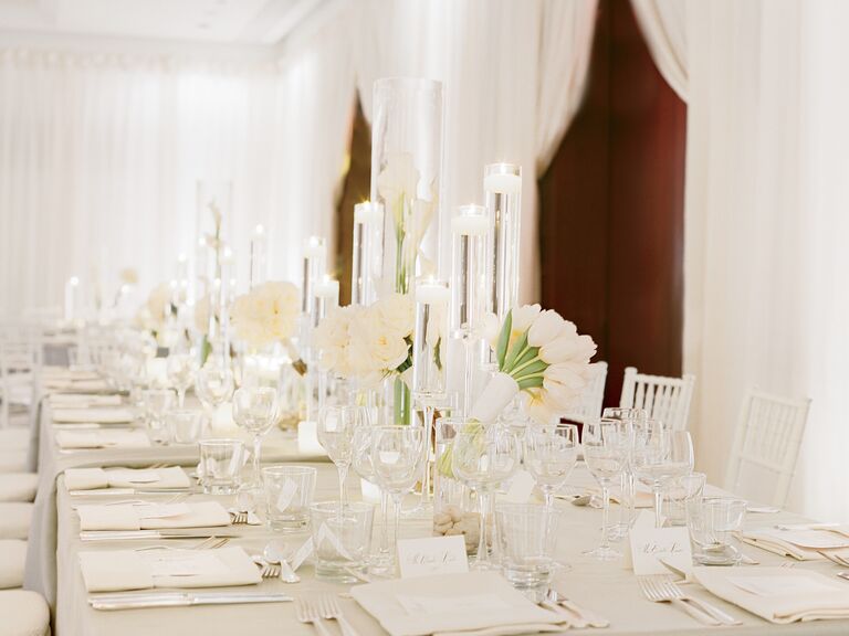
With a few exceptions (see our next fix!), you should pick two to four colors that go well altogether and stick to them. Using the same colors throughout your wedding décor will help create a cohesive flow, so every detail looks like it belongs. Narrowing your palette to a few colors will also keep elements like your centerpieces from looking too messy. If you prefer an undone look, opt for a few slightly varied shades of the same color. This will add depth without looking too chaotic. Or, for an especially striking style, go monochromatic with a bold shade, like vivid purple or creamy white. The idea is to keep the look tailored for maximum impact.
2. Mistake: Limiting Yourself to Only Two Distinct Colors
photo by PHILIP FICKS
The Fix: Break Rule #1 (Wisely)
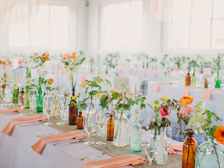
We're so over the strict two color palette rule. Many gorgeous weddings have a variety of colors—sometimes up to five—that work together. The way to pull it off is to use more than one neutral, like cream and brown, in your color palette, or go for multiple shades of the same hue to create a tonal scheme. For instance, try a summery theme inspired by the many shades of hydrangeas, including sapphire and sky blue paired with white and gray, finished off with a few pops of sunny yellow to make it feel light and bright. A palette with more than three or four colors can also help you create a specific scene—like an English garden blooming with green, yellow, pink, red and cream, or fall in New England with orange, red, yellow, brown and gold.
3. Mistake: Choosing Trendy Colors Just to Be Trendy
photo by LAUREN FAIR PHOTOGRAPHY
The Fix: Avoid Fads
It's easy to get carried away with ideas you see in other weddings, or on Pinterest and Instagram, but just because you love a fresh and unexpected idea on paper doesn't mean it's the right choice for your wedding. Your palette should be one that you won't mind living with for a long time, since you'll be framing photos and filling albums with those colors. Say you always want to be on the cutting edge of in-vogue trends, but copper is the current hot hue and you've never been a fan of metallics—don't force it. There's no need to go all out with copper table runners, centerpiece vases, jewelry and rentals. Instead, serve a fun signature cocktail in copper mugs or have the groomsmen rock understated copper tie bars. Think about the colors and patterns you surround yourself with daily. Ask yourself: What colors make you happy? What color is your favorite room or sweater? The simplest meaningful objects, like a scarf or even a pillow, inspired some of the prettiest weddings we've seen.
4. Mistake: Overdoing One Hue
photo by CHRISTINA CARROLL PHOTOGRAPHY
The Fix: Balance Bright Colors
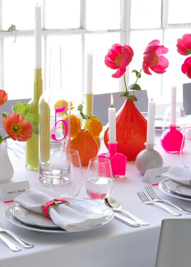
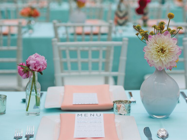
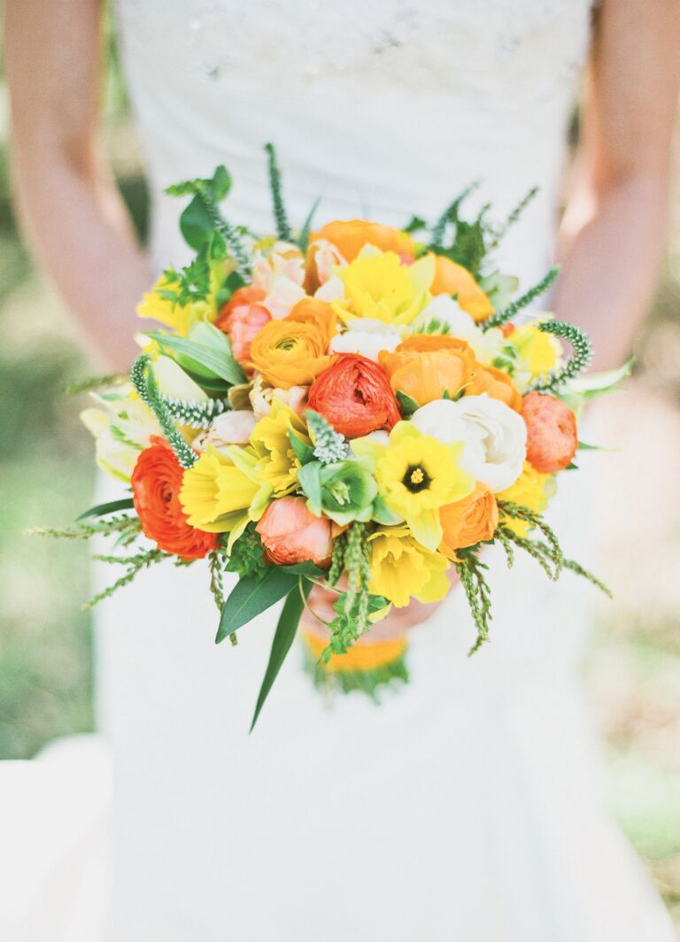
One of the biggest pitfalls in color selection is not considering the eye's need for rest. Just because you have two dominant colors in your palette doesn't mean you should use them equally. Before you go any further in your planning, decide which hue will take center stage—this choice will affect your decisions from linens to lighting. If you love bright orange, pick a more muted shade for your secondary color, like pale blue or navy instead of bright aqua. You want your colors to be complementary to your décor, but not distracting. The resulting contrast will let your favorite color shine. Thoughtfully balancing your colors is the key to making even the most crazy combinations look chic and sophisticated. Another option: Pick a few shades that are in between colors, like coral instead of bright orange and plum instead of amethyst.
5. Mistake: Choosing Predictable Colors
photo by JEN FARIELLO PHOTOGRAPHY
The Fix: Take (a Little) Risk
Certain color combos come with obvious connotations. (What comes to mind with red, white and blue, or red and green?) Keep your colors from reminding guests of their favorite holiday by subtly tweaking your hues (unless, of course, you're wedding is holiday themed). The trick is to switch up at least one shade to downplay the resemblance. So you might use peach and sage if you're worried about your wedding looking Christmassy. Or try adding another color to downplay the combo. Maybe incorporate subtle variants of yellow into your bouquet, linens or bridal party attire to add dimension to red, white and blue—it'll come across as a chic, virbrant primary color scheme instead of a Fourth of July bash.
6. Mistake: Ignoring Texture
photo by BEAUX ARTS PHOTOGRAPHIE
The Fix: Broaden Your Definition of Matching
Two colors that go together may not look right when put side by side if they're different textures. A burlap table runner with red satin linens doesn't work as well as wood planters on maroon cotton tablecloths, even though the colors are similar. Because your linens will cover so much of your wedding reception, they’ll play a huge role in your color and texture decisions. Mixing textures in the same hue can also add more drama and depth to your wedding than simply combining multiple colors. Patterns like stripes or florals can help break up bold colors, so a hue like bright yellow or black doesn’t overwhelm your tables. You'd be amazed what texture can add to a simple palette too—turn an all-white affair into a modern masterpiece that's anything but boring, thanks to varying shades of white, creative uses of space and a blend of textures and patterns.
7. Mistake: Ignoring Your Venue Colors
photo by ANNA AND SPENCER PHOTOGRAPHY
The Fix: Prioritize Either Colors or Venue
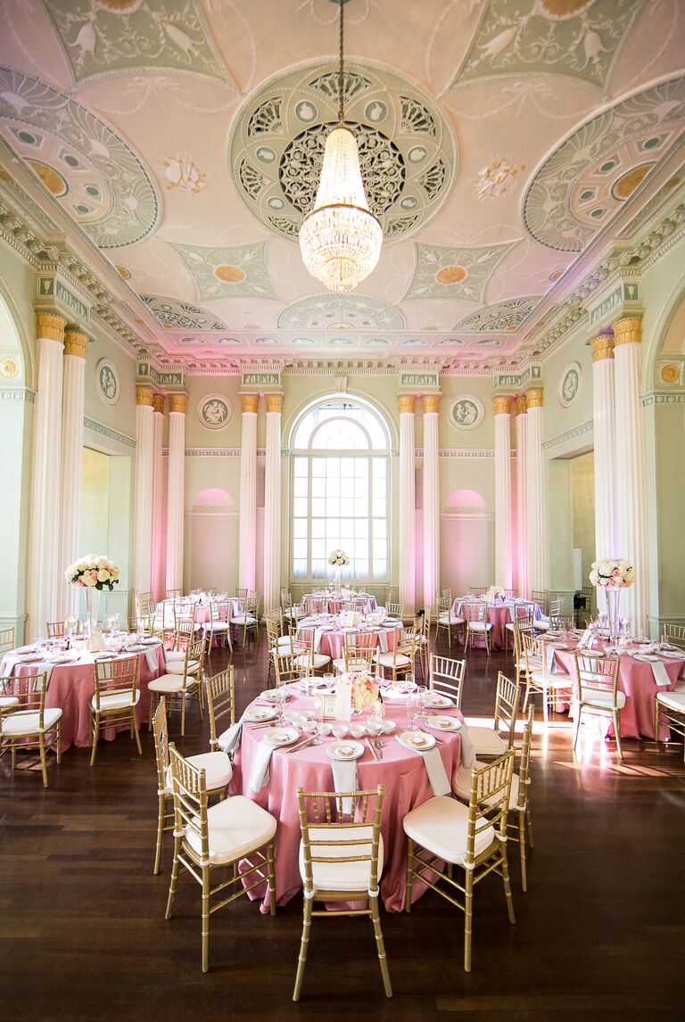
As you're venue hunting, it helps to have a color scheme in mind while you look at details like the wall coverings, art and carpeting. The other way to approach it is to keep your color options open until you find a venue you love. Think about what hues you may want to use, and whether you’d want to prioritize finding the perfect venue or having your perfect palette. In a country club with navy and maroon carpets, a color scheme of lime green and hot pink will clash, and there's really no way around it. (Try to pull it off anyway and you'll end up spending twice what you normally would in décor to cover it up.) That's not to say you have to choose a venue where your colors perfectly match the floors, but you should use the venue's décor as a guide when picking out tones and hues. Do you love pink but have dark colors to work around? Go for soft blush instead of fuchsia.
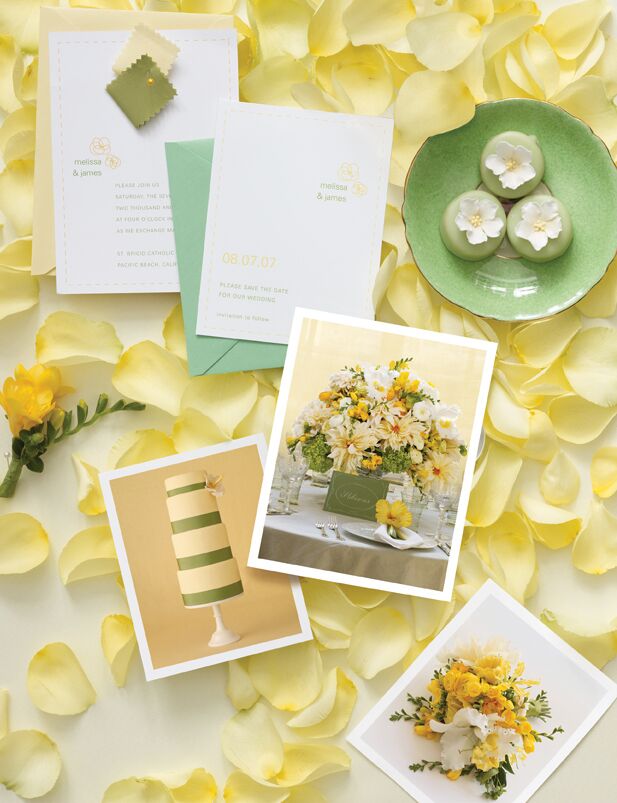
8. Mistake: Neglecting Your Paper Elements
photo by TESS PACE PHOTOGRAPHY
The Fix: Include Your Colors in Your Invitation Suite
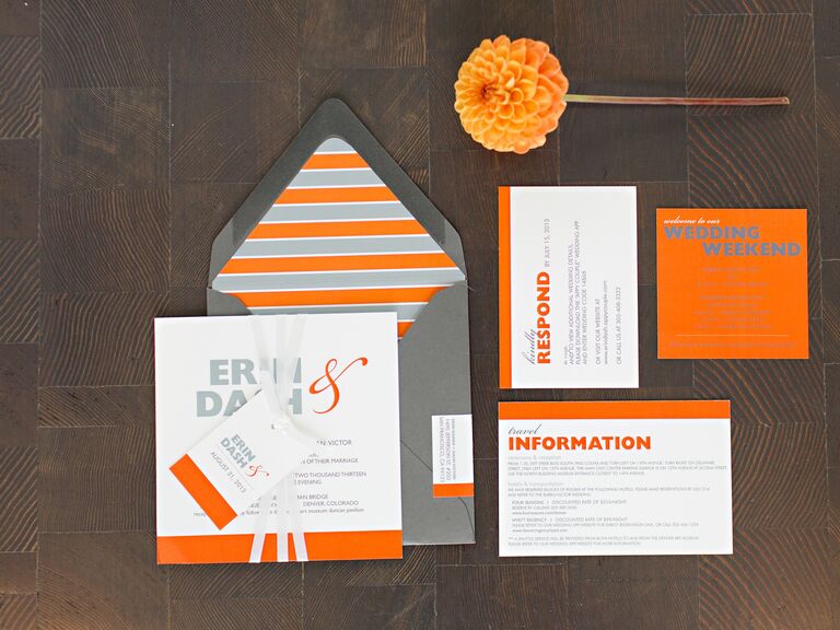
Your invitations set the stage for the event, so let them introduce your wedding colors and evoke the right tone from the start. Coordinating the invitation colors with those of the wedding can be as easy as choosing a colored font, ribbon or monogram, or as elaborate as layering colored paper. Most importantly: Don’t sacrifice readability for style. That means the type should contrast with the paper, so balance brighter shades with neutrals and avoid light-colored fonts. Bold ink hues like navy and fuchsia work well, and ask your designer about typeface techniques like letterpress or foiling to make your font stand out. Also consider that invites are a dress code cue for your guests. You probably wouldn't send out formal ivory and gold cards with black calligraphy if you're expecting guests to dress casually and be barefoot as they witness your vows by the ocean.
9. Mistake: Trying to Color-Match the Flowers
photo by JUSTIN & MARY
The Fix: Don't Force It
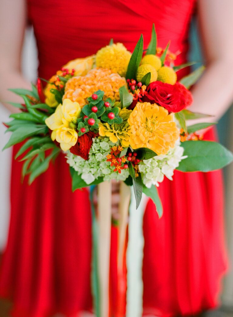
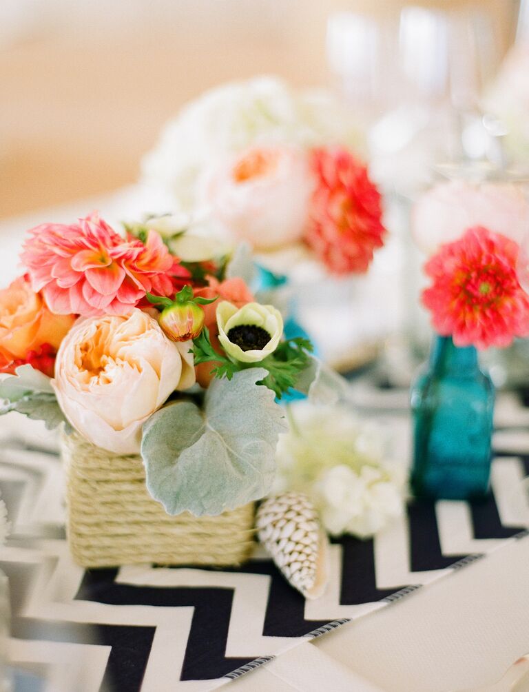
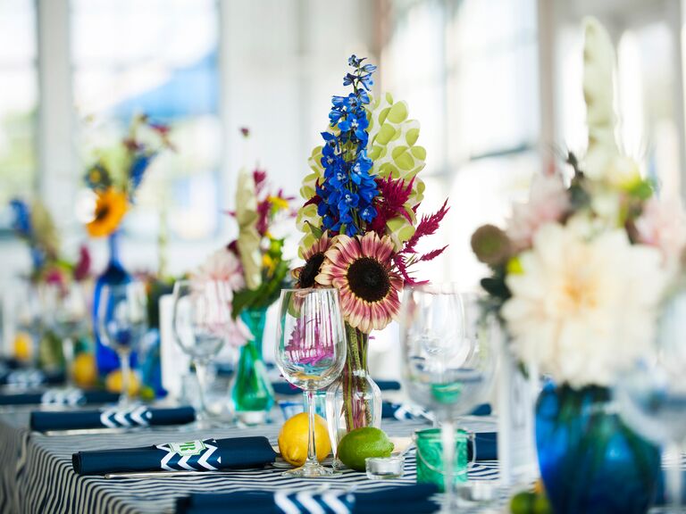
Instead of insisting your floral bouquets and centerpieces match, ask your florist to choose complementary neutral blooms that will soften (not compete with) the color scheme. Then let your nonfloral elements, like the centerpiece vases and bouquet ribbon wraps, show off your color. If you love blue, keep in mind very few flowers are blue naturally, and the ones that are, including hydrangeas, are extremely seasonal.
10. Mistake: Relying on Your Bridesmaids to Pull Off the Themed Color
photo by MELISSA ROBOTTI PHOTOGRAPHY
The Fix: Pair Complementary Neutrals With Colorful Accessories
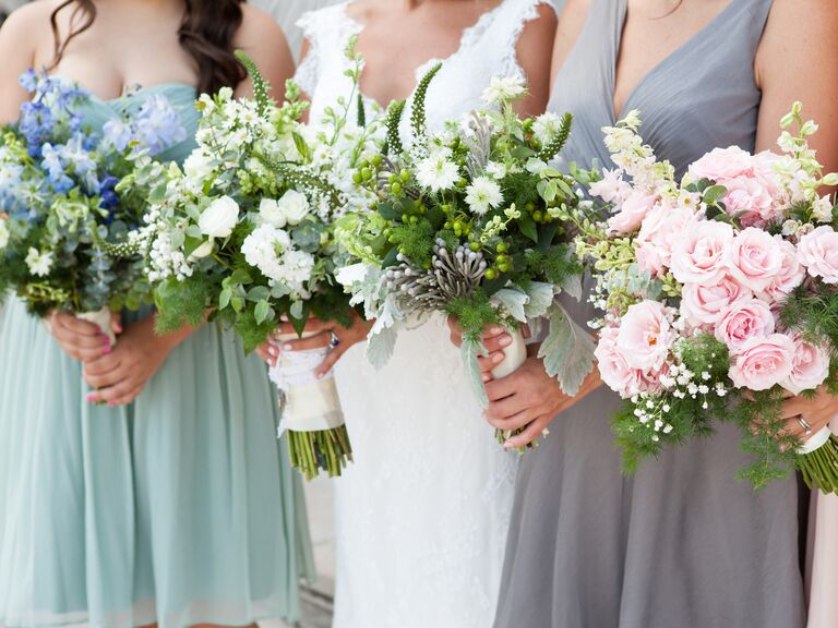
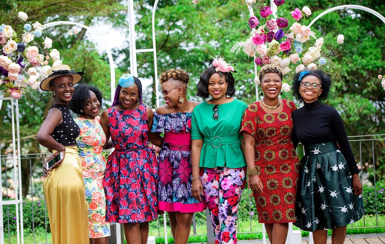
When it comes to your bridal party, choose the most flattering color in your palette—look to neutrals if you're at all unsure. Shades like burnt orange and olive green might look great on details like your table linen overlays, dinner plates and glassware, but aren't always wearable, especially if you're going monochromatic for your bridesmaid dresses. The days of having all your bridesmaids match exactly are over. Instead, it’s much more chic if your bridesmaid dresses complement your palette, and if you really want your bridesmaids to wear a bolder color, then choose accessories in that hue. Have your bridesmaids rock that color with shoes, jewelry, floral accents or a fun manicure. Universally flattering colors like eggplant, navy, blush, ivory or black are usually your best bet for their dresses.
11. Mistake: Choosing Colors That Don't Fit the Mood
photo by AARON YOUNG PHOTOGRAPHY
The Fix: Lighten or Ramp Up Your Color Palette
Though yellow may be your favorite color, it might not be the ideal shade for an evening wedding on New Year's Eve. Likewise, shimmering metallic silver might not set the right tone for an afternoon garden reception in the country. If you're set on a color you don't think will work with the atmosphere you're trying to create, think about your accent hues. Adding lots of navy can make yellow seem more refined and formal, while pairing it with white or another pastel takes it in more of a whimsical direction. Your color scheme will set the tone and mood of your wedding, so figure out which emotions you want your celebration to evoke before you pick your palette—whether you're going for a more relaxed daytime soiree or a regal and elegant ballroom affair.
12. Mistake: Limiting Yourself to Seasonal Color Rules
photo by TINYWATER PHOTOGRAPHY
The Fix: Keep an Open Mind
It's time to forget about outdated seasonal color rules, like pastels are only for spring and the idea that you can't have an orange and yellow hued wedding unless it's fall. You should pick a color palette you love and then tailor it to the particular season with accent colors, texture and décor as well as changing up the shade. The way to pull off a pastel winter wedding is to swap out rosy pink for a more muted blush and use dusty sage instead of seafoam or mint green. Pairing your color palette with seasonal flowers and seasonally inspired décor elements, like evergreens and faux-fur chairbacks (if you're having a winter wedding), will actually make your wedding style complement the season without seeming overly themed.
13. Mistake: Not Giving Visual Examples to Your Wedding Pros
photo by ANTONIS ACHILLEOS
The Fix: Get Specific About Colors
Narrow your colors down to exact shades, so instead of green and white, say if it’s lime green, Kelly green, sage green or forest green, and ecru, ivory or cream. Add any swatches or chips to a style or inspiration board to make it easier to communicate with all of your wedding pros about your vision, and help you stay focused when you’re shopping for décor. Get ideas from paint companies like Behr, Sherwin-Williams, Glidden and Benjamin Moore. Interactive color wheels and looking at palettes from weddings you like are other good places to start. If you have access to a Pantone color book, use it to select your shade the same way graphic designers do. Many invitation designers mix ink to match the colors in this book, and a lot of cake bakers use Pantone numbers as a reference when creating dye for frosting.
H/T : www.theknot.com





1 comment
best canadian pharmacy
http://expresscanadapharm.com/# Express Canada Pharm
canadian pharmacy india